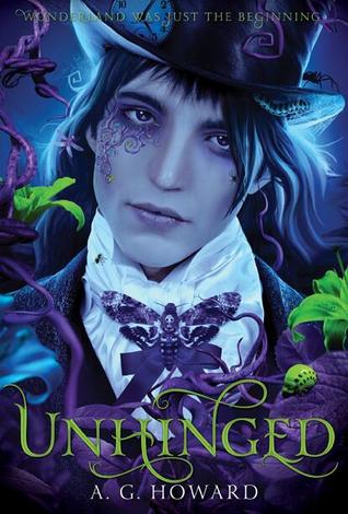
Why I love it - the color. You will quickly realize that brilliant color is key to a good cover for me. Also, the intricate detailing on the cover as well. I know most people don't like 'face covers' but this series in general are beautiful examples of how face covers can be gorgeous and completely eye catching. Drawn, with excellent attention to character details and contrasting colors. Oh, and it's Morpheus. <3 i="">
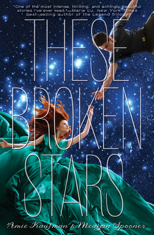
Why I love it - this looks like a movie poster. It's eye catching and beautiful, yet tells a lot about the story as well. Lilac in her signature green dress and fiery hair (I love it when covers match the actual character descriptions in the book), Tarver in his uniform, the star crossed aspect of it, the space backdrop. It's beautiful, the stark font of the title makes it look like a film poster, and again with a beautiful, dramatic burst of color.
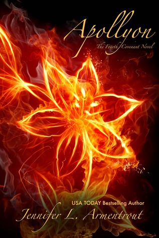
Why I love it - normally I tend to like blues/greens/purple tones most, but this fiery cover is definitely one of my favorites for this list. It looks like a firework, only more beautiful and intricate. The colors are breathtaking- this is a color palette that's striking, bold, and looks fantastic against the black background. In general this series has beautiful and intense covers, but Apollyon is my favorite.

Why I love it - This is probably one of, if not my favorite contemporary novel cover. The reason lies in the details. The title name looks as if it's been drawn on in permanent marker- there are little gaps where the marker skipped, lighter patches, etc. The whole cover (back cover included) depicts Lara Jean's room with pictures and mementos that build her character before you even open a page of the book. This is a cover that adds another layer to the story.
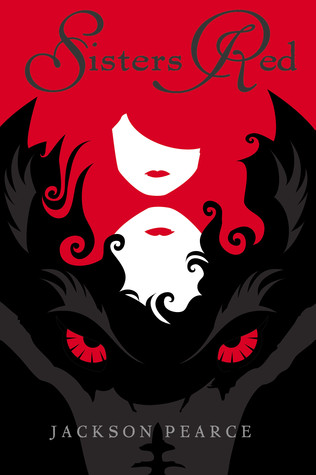
Why I love it - this is a cover that says fairy tale to me. The red and black colors are a stark contrast, and convey the dark tone of the novel, as well as the Little Red Riding Hood roots as well. The two sisters are featured, yet without much dimension so that the reader creates their own image of the story, and which sister is which.
Let me know if you like this series and I can continue on with talking about covers. I was thinking about talking about my five least favorite covers from my favorites list next, or what doesn't work for me with covers. However if you have any requests, like a post on my favorite/least favorite cover changes, etc. just let me know!
From the paper world,
V
V
Oh the love those covers!
ReplyDeleteI love these covers too, but I actually like The cover for Splintered better. But that's just me. I love the other covers too- they're all really nice.
ReplyDelete